When I teach Fair Isle knitting, I get asked about the best way to choose colours. I have a lot to say on the subject, but first and foremost I believe play is essential.
This kind of play can fit into ordinary life. A few minutes with a photograph and a colour app can later become a useful experiment with the yarn already in your stash.
From photograph to repeat
I started with a photograph of a 1970s Swedish embroidery. My house is filled with textile inspiration; if someone hand-made a thing, I find it hard to resist buying it at a market. A kaleidoscope app turns a small segment into a repeated radial pattern.
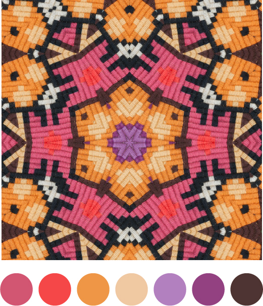
Some repeats immediately resemble the crown of a Fair Isle tam. Feed the app a fragment of a mitten, a chevron edging or a piece of lichen and the structure starts to suggest new motifs. The point is not to copy the image stitch for stitch. It is to notice proportion, contrast, rhythm and unexpected neighbours.
Take the play back to yarn
- Choose an image because its colours make you stop, not because it already looks like knitwear.
- Crop several small areas. Each crop may produce a completely different balance.
- Reduce the result to five to seven colours. Too many choices can hide the useful relationships.
- Match the relationships rather than the exact screen colours: dark against light, warm beside cool, quiet field against bright accent.
- Swatch the motif. Yarn changes colour because texture, fibre and stitch size affect how much of each shade is visible.
The natural world is especially good for this. A lichen-covered wall can contain an entire Shetland palette. The phone helps you notice it; the swatch tells you whether it works.
Back to the journal